Little did I know that when I first met Courtney and Bryce at a coffee and dessert lounge called Copper that the color of copper would be a continual theme in their October wedding…coincidence, I think not! :) They had decided on a modern, organic, and natural style that incorporated colors of burgundy, navy, and cream to be accented with hints of copper and peacock feathers. The jewel tones played beautifully against the industrial and clean style of their venue – The Prospect House.
To play off of the clean lines of the venue, we kept the centerpieces simple. Using concrete planters that had been dipped in copper paint, we added hobbit jade plants (which had a tiny hint of burgundy on the tips…that was on purpose) and moss to create a natural and beautiful design. Once the centerpieces were perfectly aligned on the wooden tables, alongside the custom dip-dyed linens from Loot Vintage Rentals…wow!
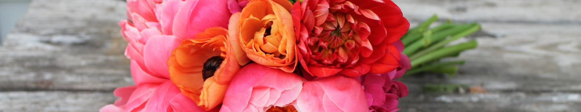
Aren’t all of the little details so fun? Fig name card holders..striped straws…ice cream bar…I can only imagine that the guests had an absolute blast! Speaking of having a blast…can we just talk about Courtney’s bouquet for a minute? I mean…
…we wanted to create something special and unique, using materials that created an array of textures and interest. From the variegated kale, to the blooming grevilia, white anemones, veronica, eucalyptus and more…this bouquet turned out stunning! Courtney’s bridesmaids chose to carry a simple bouquet of assorted greenery, which really popped against their burgundy gowns and meshed well with the fun boutonnieres that the groomsmen wore.
It was such a pleasure to work with these two sweet souls on creating floral designs for their wedding day!
To Courtney and Bryce: Thank you, thank you, thank you for being so amazing! You are such kind and friendly people, and I wish you both all the best in your future endeavors!!
*All photos courtesy of Grant Daniels Photography: http://www.grantdanielsphotography.com/ – thank you!